Top Navigation

Monday, March 30, 2009

Los Angeles Inspired

When Tanisha contacted me, she really wanted the location to come out in the theme of her wedding. She mentioned Los Angeles, "The City of Angels" a number of times. She wanted a unique response on the rsvp card and she mentioned that along the whole "Angel" idea, they were having some heavenly elements at the wedding, including a harp. I asked if she wanted angels and she loved it.
This posed a design challenge for me though. I've not ever done anything close to angels before. I started thinking about the design for the invitation and loved the idea of doing a harp.

The front of the postcard continues the flower theme from the invitation and includes an angel in the frame.

The back of the rsvp postcard has Tanisha's ideas for the response "in body" for the affirmative and "in spirit" for decline. Love it.

Then the reception card has another angel and instead of "directions" we used "City of Angels" for the directions through Los Angeles.

The envelopes wraps were designed with another floral graphic to tie all of the pieces together.

source : Gourmet Invitations 

Thursday, March 26, 2009

Press: Ambassador Magazine II


I was so excited to have a wedding featured in Ambassador Magazine. But I actually have another wedding in the same magazine! Laura Davis also coordinated this wedding and I did nearly everything paper for the reception. To see more pictures, click here to see my blog post . Photos are Courtesy of Ambassador Magazine.

Wednesday, March 25, 2009

Press: Ambassador Magazine I


I can not tell you how excited I am to be published in Ambassador Magazine. For all of you national readers, Ambassador Magazine is a Detroit publication and once yearly, publishes a Wedding issue. This featured wedding was planned by Laura Davis Events at the Royal Park Hotel. I did all of the design work at the reception and I have more photos from Arising Images in my blog. Photos are Courtesy of Ambassador Magazine.

Monday, March 23, 2009

Chicago Skyline Save the Dates


Beth fell in love with Heather's Chicago Skyline wedding invitations. What really drew her to them was the Navy Pier Ferris Wheel because her wedding reception will be at the Navy Pier! She also wanted her church, Fourth Presbyterian Church of Chicago to be a part of the skyline. I added the church and made the skyline a little softer by adding buildings faintly in the background. Beth wanted to reference the "windy city" in the invitations somehow so I not only included that in her wording on the save the date, but also in her return address!

Saturday, March 21, 2009

Company Branding | Twofoot Creative


Ana was one of my brides a few years back. She has since started her own wedding planning business, Twofoot Creative. The logo proved to be somewhat of a design challenge, but Ana mentioned that she wanted two shoes for the logo. The rest fell in to place when she sent me photos of her new client studio in bright green and hot pink and Flower border. I did two different high heeled shoes with a flower on the back of one of the shoes. For the words, I linked the two O's to form double rings and accented the word "creative". I sent her different versions so she could use the logo in many different medias.

Friday, March 20, 2009

Twin Lakes Golf and Swim Club


I was thrilled when Twin Lakes Golf & Swim Club asked me to help with their upcoming tasting for all of their weddings in the 2009 season. I designed menus for each couple to select the items that they want, complete with an area to take notes. I also designed table numbers and other signs for the event. Wish I could be there to taste some of the items on the menu - yummy!

Thursday, March 19, 2009

Brandi | Damask Wedding Reception

Brandi's Damask Wedding Invitations became the design for everything at her upcoming wedding reception. I did so many different things and some are items that I've never done before!
I designed a monogram and these pretty favor labels with the damask pattern in the background.

Bathroom Baskets Signs

Photobooth Sign

Candy Buffet Signs

Large Poster-sized Entrance Sign - Picture from Images Unveiled


And I even designed the pages for her guest book album!

Tuesday, March 17, 2009

Rachel + Joel: Modern Inspired


Rachel's letterpress invitations were all printed in a deep hot pink. Her colors are taupe and pink and were inspired by this Martha Stewart Weddings photo.

The letterpress invitation suite is just luxurious. She wanted the fonts to be the main focus and I love this font and the layout. I added a smaller divider on the invitation and that became an accent to all of her other pieces.

The RSVP has a matching custom stamp with a monogram and swirl.


The information card is pretty with the heading nestle in the wording.


The inserts were wrapped with a taupe sash, printed with the guest's names.


Hot pink liners in the envelopes are so pretty and I printed the envelopes all in hot pink.

And Rachel even order letterpress thank you cards!

Monday, March 16, 2009

Brett + Nick: Music Inspired


I have never done a music themed wedding before and now I have had two weddings a week apart! I have been talking with Brett since last July. Two things have not changed about her invitation since then - she wanted a Chicago Skyline and she wanted something with a music theme for her wedding invitations. We talked about music notes floating up from the skyline and different music motifs. Then I got the idea to make vintage record album wedding invitations.

This project proved to be one of the most researched invitations to date. I talked with many suppliers and vendors to figure out the best way to print and manufacture the 45 RPM album jackets. The record album jackets are printed with the Chicago skyline. I designed their monogram and it became the logo on all of their pieces.

The back of the album jacket was designed with their wedding invitation.

It took some hunting, but I found vintage 45 RPM record albums. I designed custom record album labels and had them custom cut. The reception information on the "A" side and the accommodations information is on the flip or "B" side of the record.

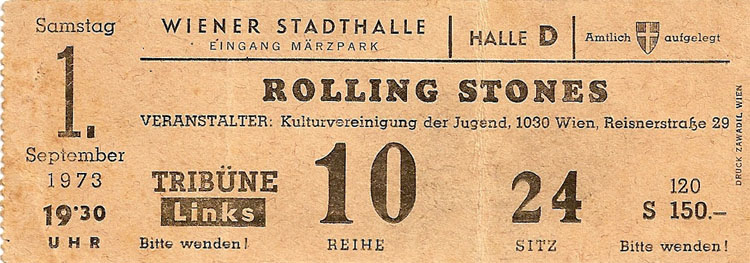
If I have to choose a favorite part of this invitation, it would be the vintage concert ticket style response cards. I used vintage Rolling Stones, Beatles and Led Zeppelin tickets as inspiration. The response card tears off for the guest to retain the travel and directions information.

The reponse card says "This portion to be given up". Although I wonder how many guests will keep it. ;) Other details that I adore are the responses: "will attend" and "need a rain check". And the names line asks for the ticket holder's names.

The response date itself is designed after one of the dates on my inspiration tickets.

Custom stamps were added to complete the response card and were designed with the same record album logo monogram. And the large outer envelopes have two skyline stamps and printed with "Do Not Bend".

Thank you Brett. You've not only changed the way I think about invitations, but the way I do business. You inspired to me come up with an invitation that is more unique than anything I ever thought could possibly come out of my little head!

Thursday, March 12, 2009

Jennifer + Aamer: Music Inspired


This invitation started out as a pretty typical pocketfold. Jennifer contacted me last year and asked if I could design her invitations. When we started talking about design, Jennifer said that music was a big part of their life and it was what brought them together. But coming up with a music themed invitation that wasn't cheesy or that both Jennifer and Aamer liked proved to be a challenge. Jennifer even joked at one point that I was probably regretting taking them as clients!

But then one morning it hit me. Why not make the invitation a CD! I pitched the idea of CD wedding invitations to Jennifer and they loved it. They had even commented to each other that one of their engagement pictures from Mark Brooke Photography looked like the cover of a music CD.

The CD itself is professionally printed with their wedding invitation. This sound wave graphic became the underlying theme on all of their pieces.

The CD jacket has this AWESOME photo on the front. On the back is the list of songs that they burned onto each CD. I also included a photo on the back of the two sitting on the beach with their record collection. And I designed a small barcode with their wedding date.

The CD was placed inside the pocketfold and the inserts included the RSVP postcard and accommodations insert.

Aamer wanted very fun responses on the RSVP. He not only came up with this set of responses: "wouldn't miss it for the world!", "can't make it due to an allergic reaction to fun" and "what was the greatest thing before sliced bread?", but EIGHT others! And I added my own fun and put the comment "Please mail this to us by April 11th. Look it even has a stamp!" on the rsvp.

The outer envelopes were printed with the coordinating sound wave.

Thank you Jennifer and Aamer for trusting my crazy idea would work and being some of the funniest and kindest clients that I have had in a long time.

Wednesday, March 11, 2009

Caitlin + Jason: Wedding Inspired

Caitlin wanted a pretty silhouette of wildflowers on all of her wedding pieces. I designed her Save the Date magnets and she loved them so much she said "I LOVE THEM. I want to stick them to every single magnetic surface that I see!!!"

So when it came time to do the invitations, we were all set to use the same graphic.

I did some fun new things though and designed the postcard with this pretty navy blue floral pattern.

The reception card has a tiny section of the graphic and ties the pieces together, but is different than the entire graphic.


The envelopes are likely my favorite element.


You can buy this stamp here!

Tuesday, March 10, 2009

Beth + Alden: Venue and Dress Inspired


Beth wasn't certain of the elements that she wanted on her invitation. She sent me this AMAZING photo of her wedding dress.

She also told me that she really loved her venue, the Westin Book Cadillac in Detroit. I remembered seeing this photo in Arising Images blog. These two photos became the inspiration for her invitation suite.

Beth's colors are chocolate brown and the lightest peach color. The invitation was printed in these two colors with this vintage looking graphic that has similar flowers to her dress.

The RSVP postcard was designed with a pretty monogram, emblem. Her inserts were wrapped together with matching peach ribbon. If the post office wouldn't charge more for a bow, I would have loved to have tied it to match the sash on her dress.


And I did a complimenting graphic on her side flap opens.