
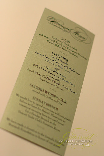
And also menus in gold and layered with plum.
 Nicole asked me to design a seating chart for her fall wedding reception. She wanted autumn leaves and a swirl graphic.
 I also designed a welcome sign for the wedding reception
 I've been talking to Tammi for over a year. From the beginning, Tammi knew that she wanted a chandelier on her invitation suite to depic the style of her 1840's Ballroom wedding.
 I really wanted hang the chandelier differently on these invitations. I designed a chain to hang from the "ceiling". The black invitation with silver writing is very stiking and I added a silver backing to accent it further. A swarovski crystal "hangs" from the bottom of the chandelier for another punch of "wow".
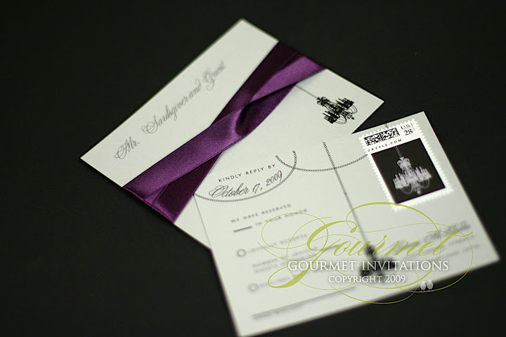 The RSVP postcards were designed with chandelier postage stamp that also hangs from the postcard from a chain.
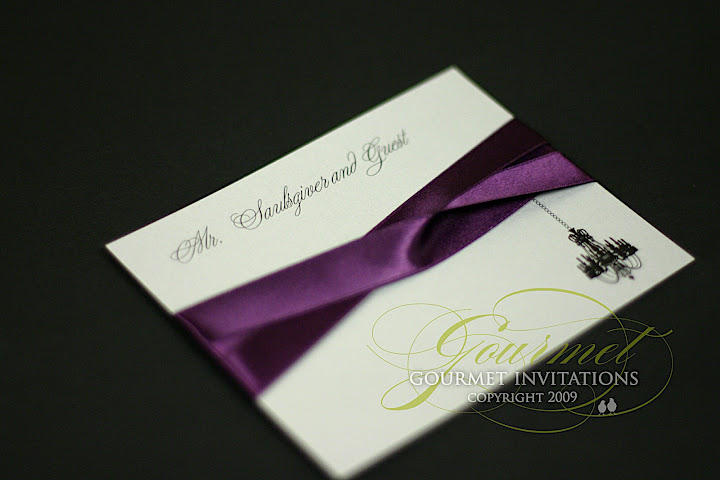 The front of the post is personalized for each guest so there is no need for a line to fill in the names. The chandelier hangs from the amethyst ribbon which is Tammi's accent color.
 The reception card has three chandeliers and was designed in black with silver writing.
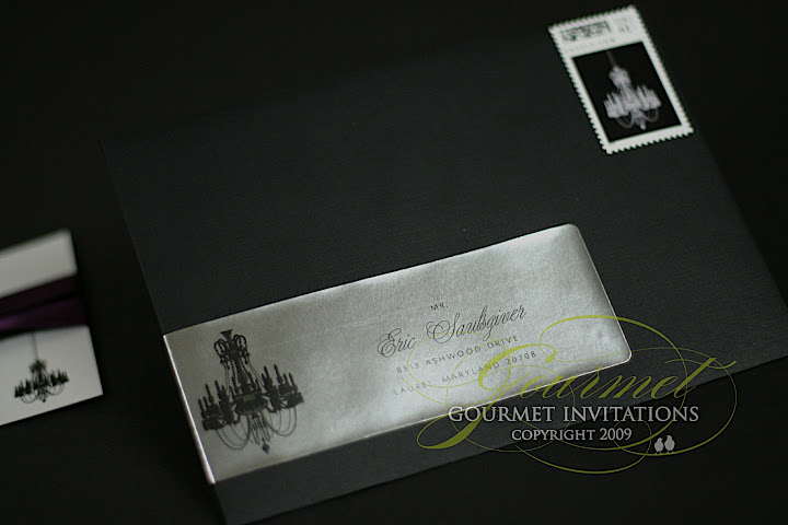 The black envelopes have a metallic silver envelope wrap and another chandelier custom stamp.


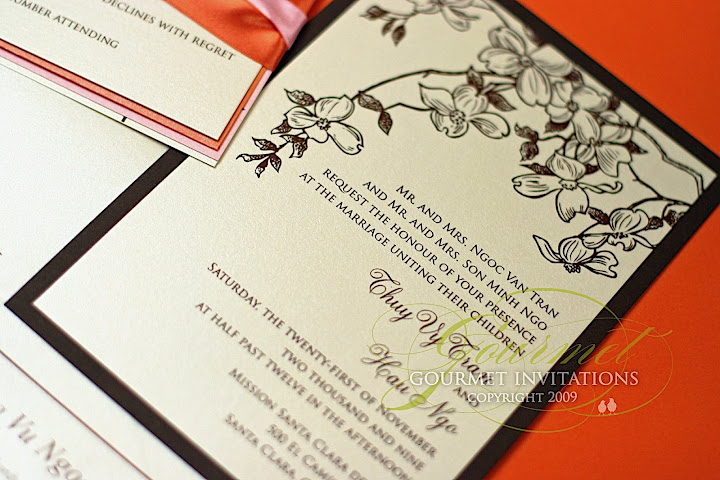 There will be branches in her centerpieces with flowers so I designed these invitations with a branch and floral graphic.
 I did something fun with her insert package. I wrapped them with two different colors of ribbon. Her colors were so fun in chocolate, orange and cotton candy pink.
 Custom maps were designed for her ceremony at Mission Santa Clara de Asise and the San Jose City Hall Rotunda wedding reception.
  The vietnamese invitation suite was designed slightly different to satisfy many cultural differences.


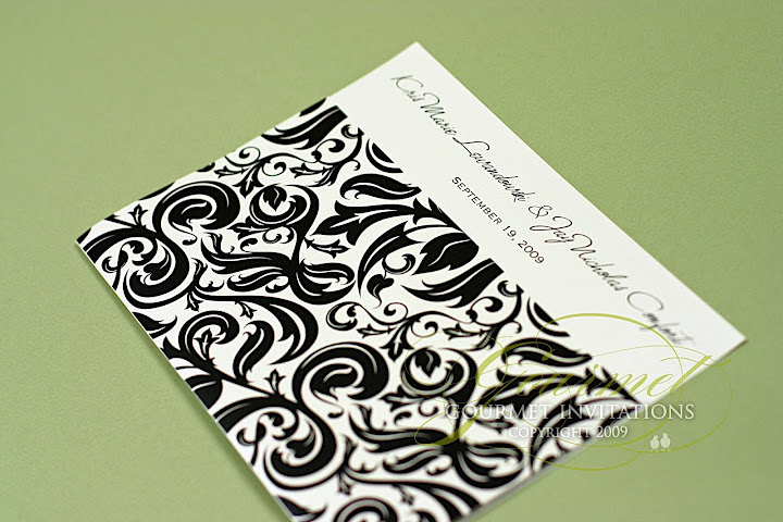
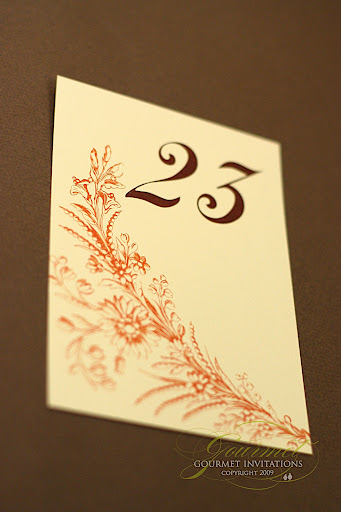
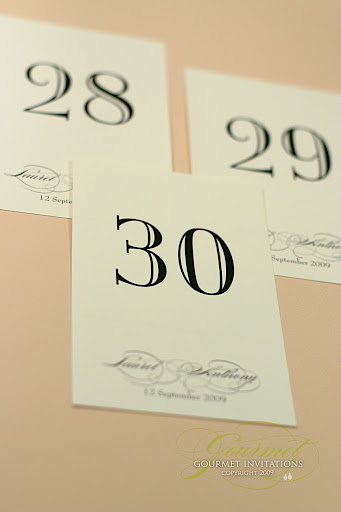
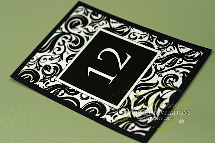 And the table numbers are stunning in all damask with white numbers.
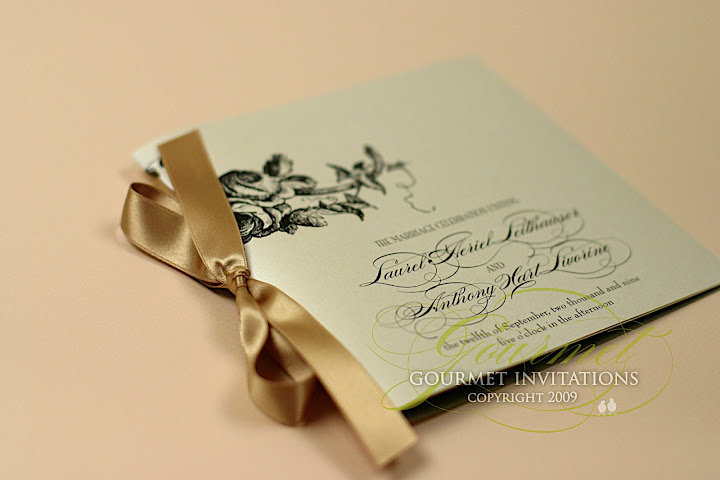

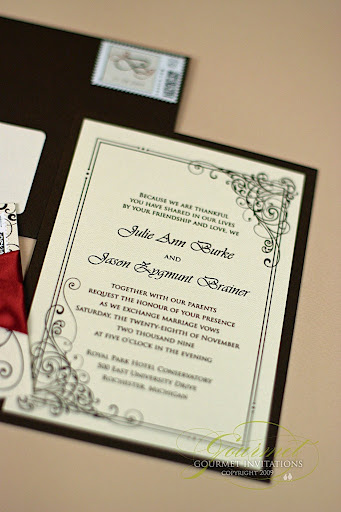
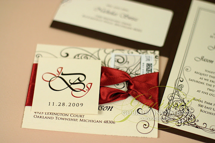
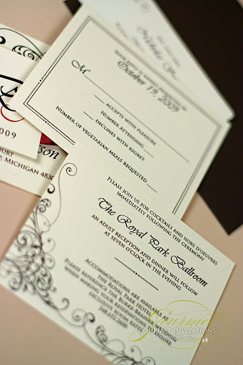
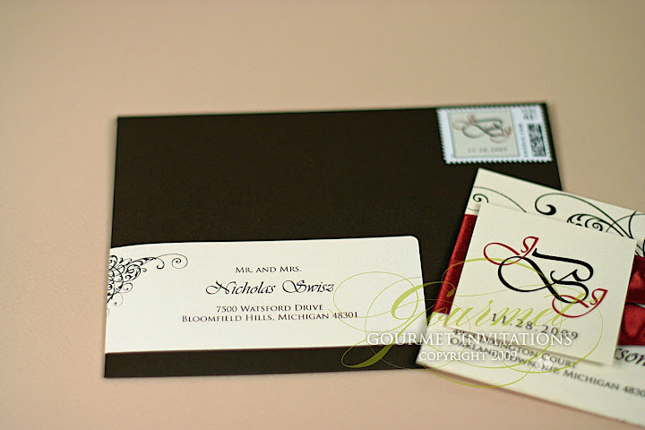
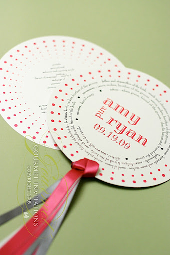
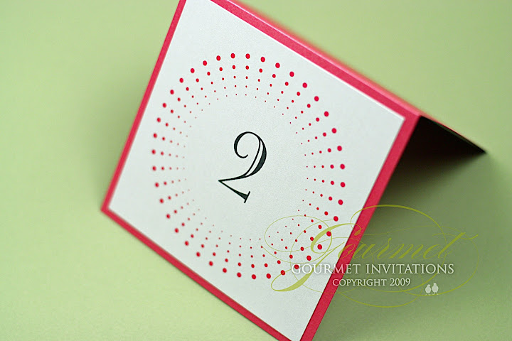
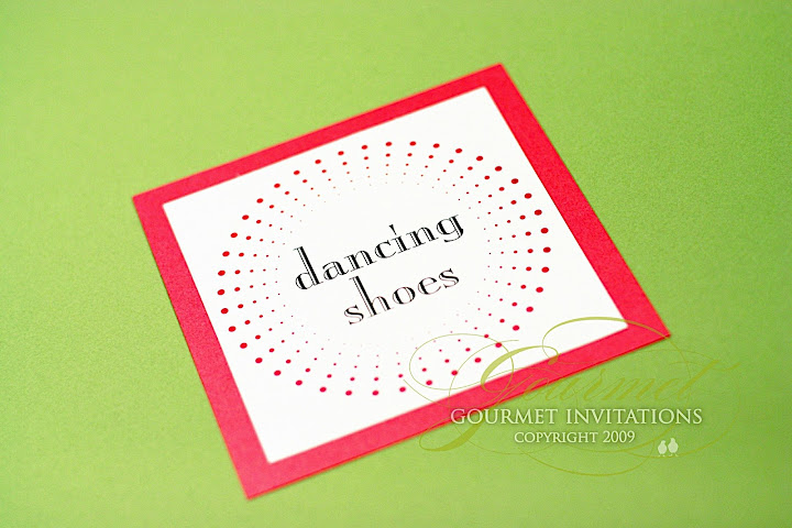
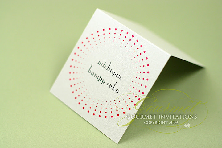
 Sara's swirl and dot graphic with the brown and citrus lime color scheme was a stunning event. Coordinated by Laura Davis Events and photographed by Jessica Johnston, this Townsend Hotel Wedding is sure to be on the blog again. :)
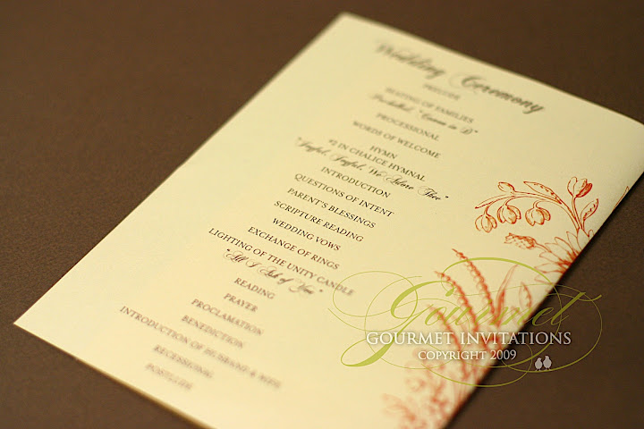
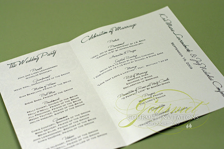
 Cardstock cover programs detailing the Greek Orthodox Wedding Ceremony.
