Top Navigation
Tuesday, October 28, 2008
Alyssa's Extras
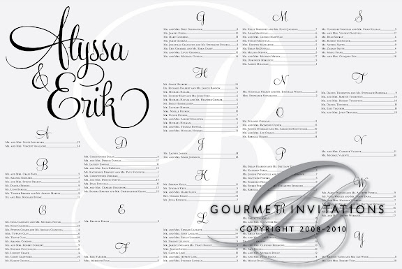
Alyssa contacted me about making the extra items for her reception. She sent me an inspiration board and she wanted her table numbers to be the inspiration for all ofher pieces. Inspiration boards have been used by interior designers for years and now they are making their way into the wedding world as well. After locating the font (my new favorite) everything fell in to place. Her table numbers are all custom with each letter custom to achieve the look we were going for. The monogram "R" is in the background on all pieces, except the programs. For the programs, I designed a premarried monogram that was then put on the seating chart.
Lindsay's Art Deco Wedding
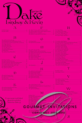
Lindsay's Art Deco wedding is so vibrant with the black, silver, and hot pink color scheme. Since the linens are hot pink, we did all of her table numbers and signs in silver. I also made hot pink favor labels for her candy buffet bags. Her seating chart is hot pink to add a touch of color at the entrance where there typically may not be color.
Thursday, October 23, 2008
Christina's Damask Pocketfolds
Funny thing about this photo - my 4 year old son took it. ;)
I know I keep saying it, but my list of favorites just continues to grow! Damask wedding invitations - particulary black damask invitations - are the hot trend at the moment. These invitations are in a damask embossed pocketfold! I used the same graphic throughout the pieces and I adore the lower case script font for their names. Christina's words were "I love my funky invitations". :) The invitation is to the reception only and in the pocket is the RSVP postcard. Some of the guests are receiving a special insert for their small intimate ceremony. Christina's envelopes are in my new side flap envelope that opens at the top! And her damask custom postage is a perfect match to the damask envelopes. Thanks Christina! We never met and you went sight unseen with all of the colors and the new products.
Elyn's French Postage Invitations
Elyn contacted me from Toronto to do her invitations. Elyn and Johnathan have traveled to Paris and she wanted her invitations to have a French theme. Her wedding reception is going to have a French cafe theme - complete with chalk board menus. :) We knew that the Eiffel Tower would be on the wedding invitations. The original idea was that a fleur-de-lys would be the other graphic on the pieces. But when I got the idea to do a custom postage stamp that looked like a French Air Mail stamp, I took a totally different turn. I got the idea to the invitations with a French stamp theme - different, I know. I didn't even mention it to Elyn because to hear it, the theme doesn't sound appealing. Each piece has custom postage, cancelation marks, and envelope stamps. The RSVP is completely in French and I told Elyn I might have gone too far, but they loved it. And I finally got a bride to do the symbols of a cow and a fish instead of words for a meal choice! I simply love these invitations and I'm so thrilled that I could design them for such a wonderful couple.
2009!
I don't know where the 2008 wedding season went. But it's time for 2009 already! And 2009 is starting out amazing. All of my January 3rd brides sent me their addresses over a month early! Megan was no exception. She wanted very formal invitations for her black tie event. We went with this printed plumes & scrolls black cardstock and paired it with a swirl ornament on all of the pieces. The black envelopes just scream formal and we did pretty envelope wraps with coordinating custom postage.
Tuesday, October 21, 2008
Photo Booths
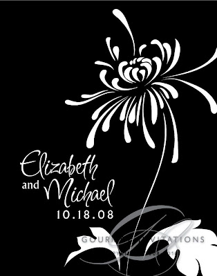
This is definitely the new trend - photobooths at the wedding reception. I've been stalking the Inner Circle Photography blog waiting for pictures of Elizabeth's wedding from last weekend. Then they posted these pictures of Elizabeth and Michael in the photo booth by Shutterbooth ! I just love how my monogram looks at the bottom of the photo strip. :)
Saturday, October 18, 2008
Postcard Save the Dates
These are my first that I've made on my own! Jennifer and I have been talking for months. She found me in her search for Fleur-De-Lis invitations for her New Orleans wedding. Besides the Fleur-de-lis, her wedding is taking a somewhat vintage theme since she purchased an authentic 1930's wedding dress! So I designed these with a pretty swirl that mimicks her wedding dress behind the fleur-de-lis. The postcards are also addressed for her! Can't wait for the wedding Jennifer!
Tuesday, October 14, 2008
Jennifer Destination Wedding
Elizabeth's Amazingly Unique Reception
Elizabeth's box invitations are also on my favorites list. Her wedding is one of the most unique I've worked on. The reception is on the floor of an art gallery and they are doing strolling appetizers - including a macaroni and cheese bar! Since there are no seating or menus, I did other pieces for her. I designed the logo for her Photobooth pictures through Shutterbooth. I also did a pretty entrance sign that she is hanging in her house, unity candle, and this bar menu that is hanging in a three section frame. And my favorite item - waterproof labels that are going on milk cartons for their favors - cookies and milk!
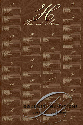
Sosi's Paisley Wedding
Sosi's Armenian dual language invitations were another of my favorites this year. For the wedding, we did the same paisley print on her seating chart with a whopping 235 lines! I also used the same monogram on thank you cards and table numbers.
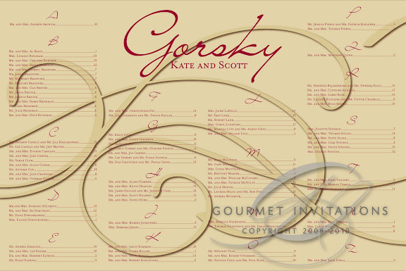
Kate's Swirl Theme Wedding
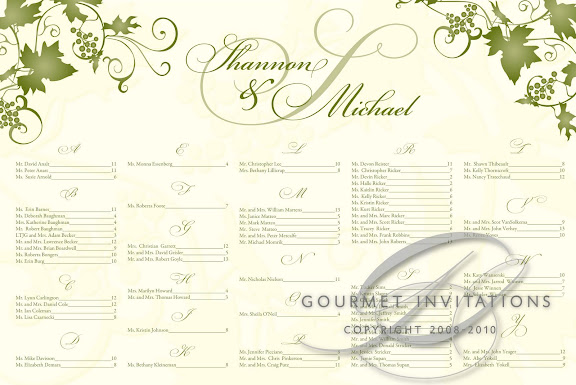
Shannon's Wine Country Wedding!
Shannon is having her destination wedding this weekend at the Faulkner Winery in Temecula, California. I did her seating chart, table numbers (wine labels!!) and programs that she put together herself with raffia.
Stacy's Swirl Wedding
Stacy's swirl graphic with the "leaves" turned out gorgeous on all of her pieces. I put it on the bottom of all pages of the program and at the top of her deep red invitations. I also did a unity candle, table numbers, bar menu and guest book signs. And again - an amazing brown and red seating chart. A big, huge thanks goes to Stacy and her mom! You guys gave me faith again that brides and their moms can actually be nice, even in times of stress. :)
Julie's Poppy and Library Themed Wedding????
This was one of my favorite weddings of the year. Not only did I love Julie
and Steven, but I loved the graphic and everything that I did for the wedding - which was a ton. The Poppy on a branch graphic is gorgeous and it appears on everything. The orange menus are gorgeous and I did various signs for all over the reception held at the Royal Park Hotel. Another reason why I loved Julie - her signs didn't rhyme. I really dislike rhyming signs and Julie did simple phrases for the bathroom basket, guest book and even a sign for cigars.
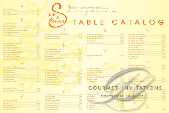
So where does the Library theme fit in? Julie and Steve are both librarians! I suggested for the seating chart that we call it the "Table Catalog". I even made tiny pieces of "scrap paper" with their monogram and they displayed them in a wood box right from the library and mini golf sized pencils so their guests could write down their table number. The numbers were call numbers for books that were of significance to them. 308.81 "There's a Spouse in My House: A Humorous Journey Through the First Years of Marriage" and 307.73 "A Girl's Guide to Dating a Geek" were among my favorites.
For more pictures of this wedding, you can visit Tracie's blog and Arising Images blog. Later, I'll post the video trailer from Take1!
Subscribe to:
Posts (Atom)