Top Navigation
Friday, July 31, 2009
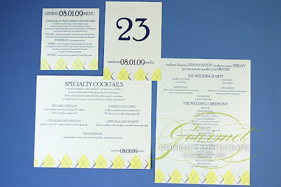
Andrea's Argyle Wedding Reception
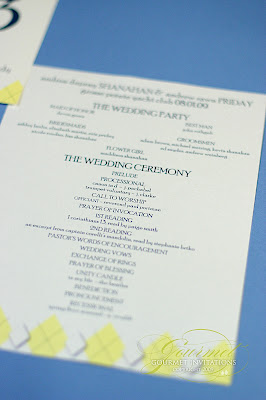
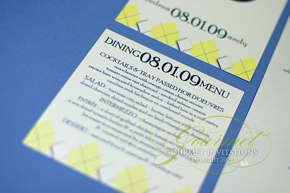
Andrea's argyle wedding invitations are so unique in the yellow and navy color scheme and are SO Andrea and Andy. The invitations were very unique in all of the pieces and I wanted the wedding pieces to continue that uniqueness.
Single sheet programs with no folds
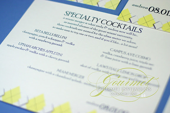
Signature Cocktail Menu with Miami Merger theme!
A square menu to sit on top of a square napkin
Argyle Seating Chart
Table numbers
Thursday, July 30, 2009
Awesome Wedding Entrance
This has been all over the internet and with over 12 million views, you have likely already seen the video. But just in case you haven't, check out this awesome Dancing Wedding Entrance. I just love it when couples make the wedding their own, and this couple did just that.
Tara's Peony Wedding Reception
Tara's peony gatefold was one of my favorite new designs this year. All of the wedding items continued the peony theme and the fuschia and silver color scheme. The seating chart includes the Chinese symbols for double happiness.
Programs
Table Numbers
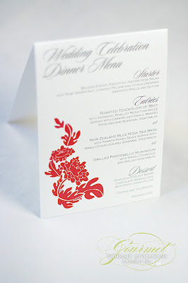
Tented menus for each table.
Programs
Table Numbers
Tented menus for each table.
Wednesday, July 29, 2009
Envelopments design
Warm, rich colors and a tropical theme was the inspiration for this couple's wedding invitations. The 4x5 pocketfold is from Envelopments and holds the RSVP postcard and the directions and reception card.
Monday, July 27, 2009
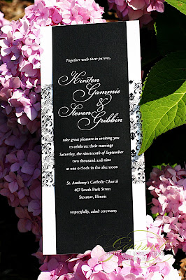
Kirsten + Steven: "Something New" Inspired
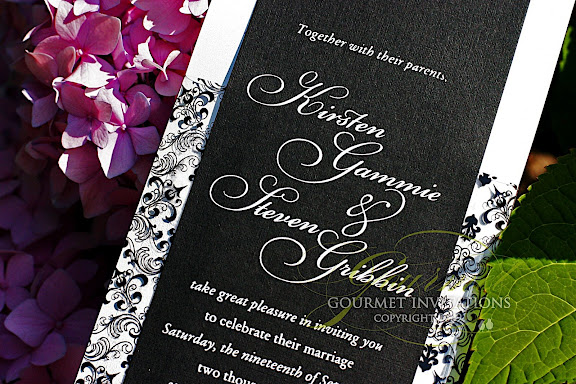
This invitation came from Kirsten saying that she really wanted me to do something different for her invitations. Thankfully, Kirsten was up for helping with the challenge. I had an idea - that I hope to use in the future ;) - that resulted in Kirsten searching store after store and the two of us emailing for hours looking for supplies online. Kirsten finally found this funky mylar at Archivers and she fell in love with it.
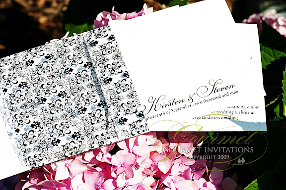
I wrapped the mylar around a white card to show off the print. But to take the different idea to another level, I printed black linen cardstock with white ink - my first ever. I love the results.
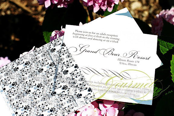
The inserts were tucked into the back of the mylar.
Tragically, I got a call from Kirsten just as these were ready to ship. Her house burnt down and they lost everything - including her wedding dress. They made the hard decision to postpone the wedding. Kirsten still wanted to have an invitation because she loved them so much and was thrilled that I still wanted to show them off in the blog. Good luck to you and your family Kirsten and I can't wait to work with you again in the future.
Saturday, July 25, 2009
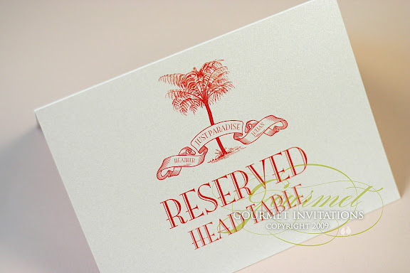
Heather + Julian's Glamour Inspired Wedding Reception
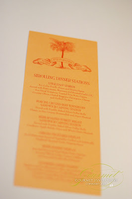
Heather and Julian's wedding takes place today at the MGM Grand in Detroit. Laura Davis and her team have orchestrated an incredible event and I'm so forturnate to have been a part of it. Items included over 450 menus.
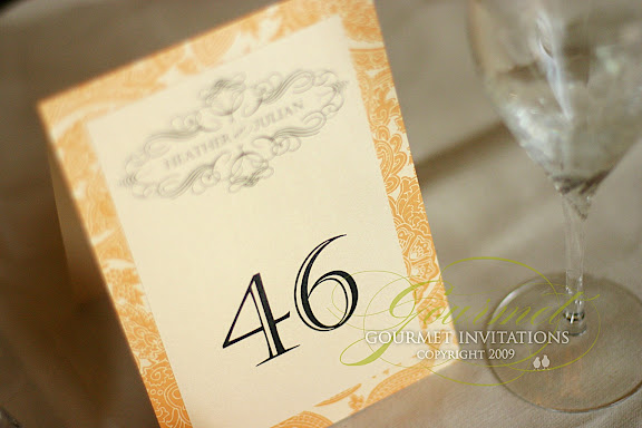
Table numbers with their custom designed monogram.
Placecards that I designed with a frame around each name.
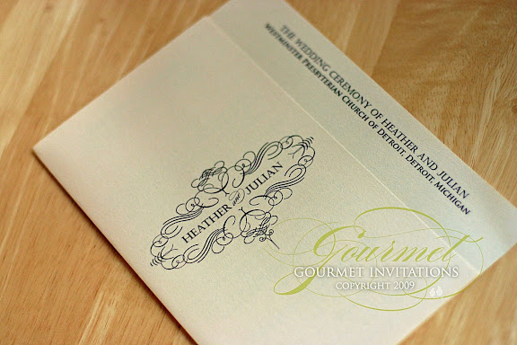
And ceremony programs.
Table numbers with their custom designed monogram.
Placecards that I designed with a frame around each name.
And ceremony programs.
Friday, July 24, 2009
Heather + Julian's Rehearsal Dinner
Heather and Julian's rehearsal dinner is going to be a bigger event than some bride's wedding! Laura Davis is coordinating this event and she asked that I design their menus and other pieces for this amazing event.
Because the events of the weekend are so large and so many guests will be traveling from out of town, there are many shuttles for the weekend. I also designed various signs for the MGM Grand lobby.
Thursday, July 23, 2009
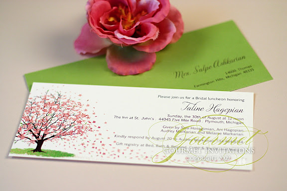
Taline's Petal Shower Invitations
Tuesday, July 21, 2009
Sara's Pomander Wedding Reception
Sara likely has the most items that I have ever done. :) I loved her Pomander theme and the black and pink colors are a hot trend this year. We did a seating chart. . .
Custom water bottles with waterproof labels
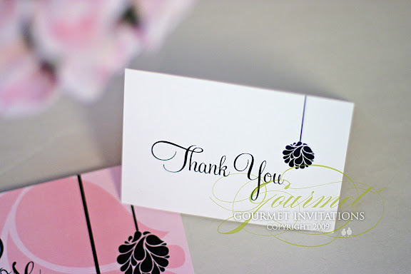
Thank you cards
Table numbers
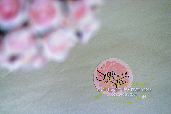
Custom favor label stickers for her out of town boxes and cake boxes
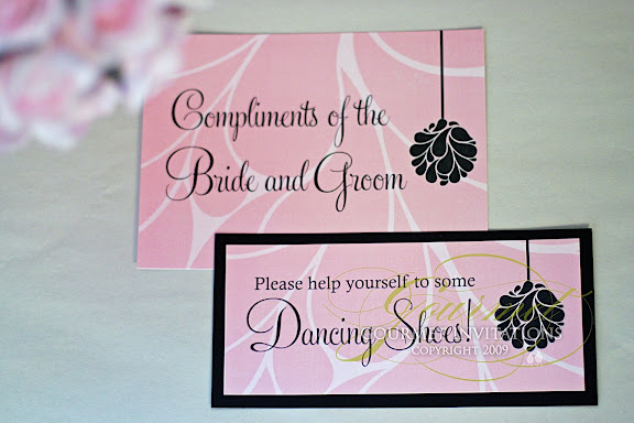
Signs for bathroom baskets and flip flops for dancing
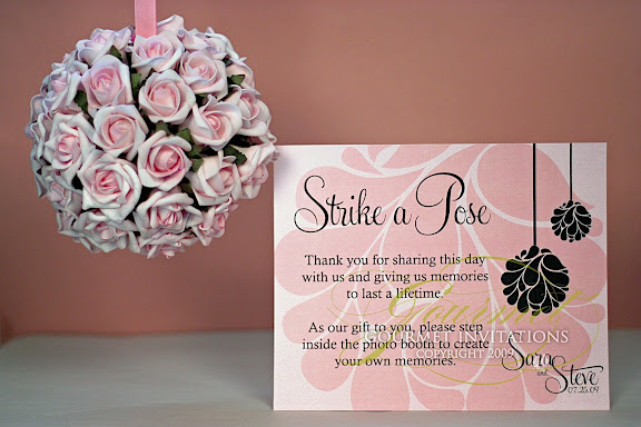
Sara is doing a Photo Booth for her favors. I made this sign for outside the booth. . .
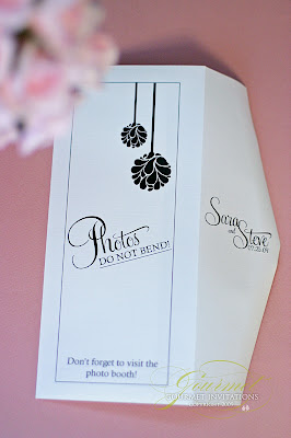
then Sara wanted an envelope for her guests to put their photo booth picture inside. The plan was to have a table set up with the envelopes and another sign. But I didn't like the idea that some guests might miss the booth. So I suggested that we make a package with the menu. The envelope wraps around the menu . . .
and forms a pretty package that will be wrapped with pink napkins by her coordinator, Misty from Bells and Bliss
then inside each envelope is a card with information to share photos online
I even designed the custom monogram for the photobooth pictures.
And somehow I managed to forget to photograph the programs. whew!
Monday, July 20, 2009
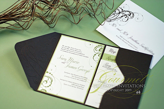
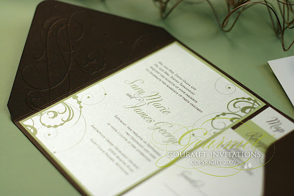
Sara + James: Embossed Pocket Invitation
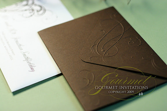
Sarah and James met with me less than a month ago. They just couldn't find a catalogue invitation that they liked and their wedding coordinator, Laura Davis, suggested they come to me for custom invitations. They were immediately drawn to the embossed pocket fold invitations
They choose a deep brown pocket embossed with swirls.
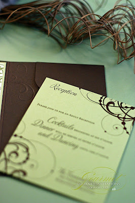
They choose a beautiful celery green and cream paired with the chestnut brown for all of their pieces.
The reception card and all of the inserts were designed with the same swirl and dot pattern of the pocket.
Custom maps were designed to cover a large area and includes information for accommodations.
Friday, July 17, 2009
The Big Day: Mary + Duncan
Wedding Vendors:
Invitations: Paper Pals Custom Invitations ~ Pullman, Washington
Wedding Venue: Brides Family Farm ~ Palouse, Washington
Reception Venue: Brides Family Farm ~ Palouse, Washington
Caterer: Old Post Office Wine Cellar ~ Pullman, Washington
Cake: Aunt of Bride ~ Palmer, Alaska
Flowers: Neill's Flowers ~ Pullman, Washington
Photographer: Doug Park ~ Seattle Washington
Dress: Kim Monk ~ Moscow, Idaho
Suit: Macy's ~ Moscow, Idaho
Rings: Sam Dial Jewelers ~ Pullman, Washington
Tables/Chairs/Plates: Sun Rental ~ Pullman, Washington
Tuesday, July 14, 2009
Amy + Ryan: Dots and Circle Inspired Invitations
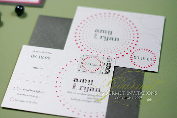
I met with Amy and Ryan, along with their wedding planner Ana of TwoFoot Creative. At the time, they didn't even have a reception location or color scheme! But in the following weeks, everything came together and Amy knew that she wanted something fun and lowercase. She was also drawn to dots and circles. The colors are very hot in a deep slate grey and hot pink!
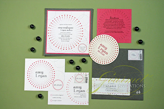
We were originally going to do a 4x9 panel, but I got a vision for an invitation and it was asking to be on a square panel. :) Amy agreed without seeing the design even. The invitations came together faster than nearly any I've done. I designed this circle and dots pattern as a frame around her wording.
Then I designed another circle and dots background for the invitation and place the reception info in a smaller circle in the corner.
The RSVP postcards were designed with a monogram that you'll be seeing on everything.
The back of the postcard continues the dots and circles design with custom designed stamps.
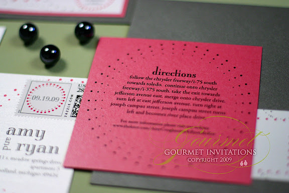
The directions card was designed with a circle frame and I made the fuschia card a square to compliment the design. The directions are to her reception at the Rattlesnake Club in Detroit.
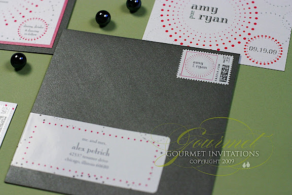
Her graphite envelopes have another custom stamp and a wrap around envelope label that I designed with more circles and dots.
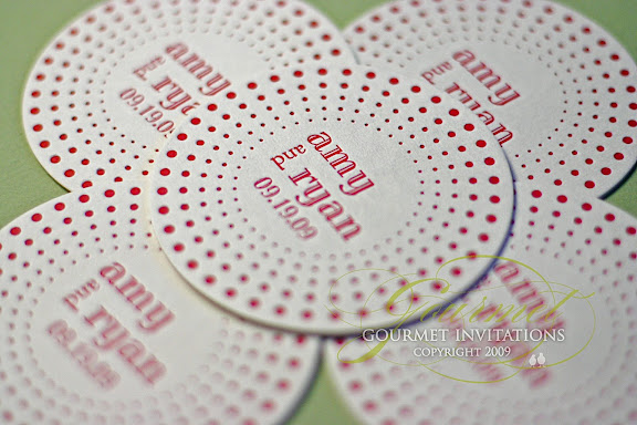
If the invitations aren't amazing enough, the custom coasters are just over the top. The coasters are letterpress in hot pink and the dot design creates awesome impressions. Would love to do these as save the dates and as a letterpress dot invitation.
Subscribe to:
Posts (Atom)