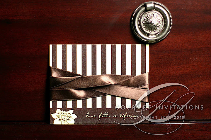
I started talking to Julie about her design last December. She knew that she wanted something vintage, but she was loving damask. She also said "There is somewhat a french gardens (tulleries) theme to the wedding if that helps. So, I guess I like a more antique damask rather than anything super modern." I suggested doing a more floral damask to pull in the garden theme of the reception. Within a day we had settled on the graphic and then the fun began.
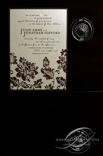
I made a custom grunge effect to make it look worn and vintage.
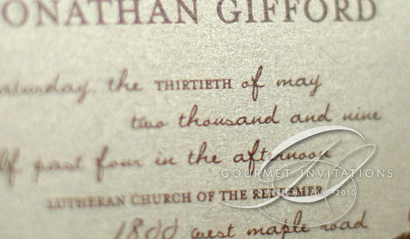
I started with the graphic to get Julie's style. Even though she wanted vintage and not modern, her comments led me to take a chance at this awesome font layout and type. I love the lower case script and upper case serif font.
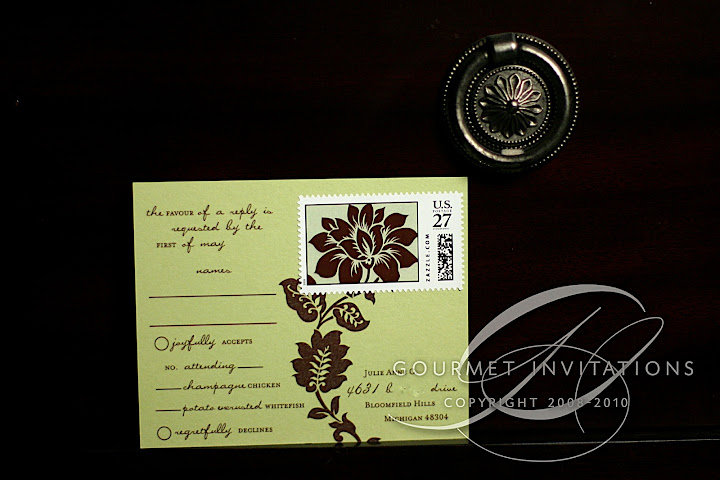
The rsvp postcard was designed with a stripe pattern for that formal vintage feel. I included a saying that I really liked at the bottom and it will be showing up in its entirety at the wedding.
Custom stamps were added on the back to complete the floral pattern.
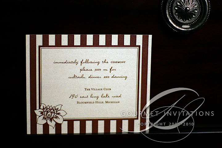
I continued the stripe pattern on the reception card.
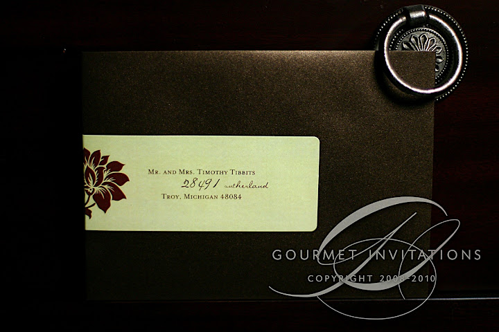
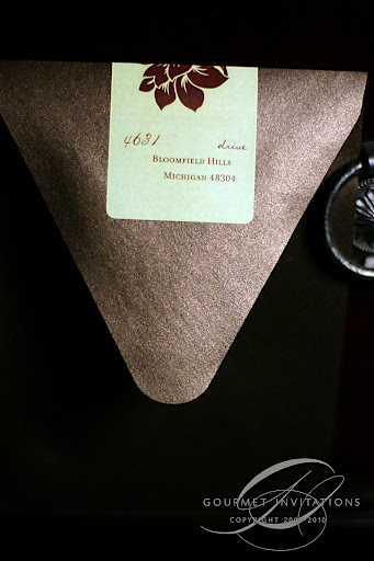
Envelope wraps complete the look on dark brown envelopes with side flaps.