I have not one, but two winners of the
Seating Chart GiveAway!
First winner, selected by me is Julia C! She is from Michigan too and I can relate to her story.
Julia’s entry …
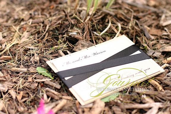
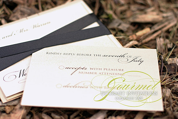
Hi Tifany, thank you for this wonderful gift! Your designs are pieces of art and I would so appreciate having the opportunity to have one of your amazing pieces showcased at my wedding next March 20th, 2010. I am in love with your invitation set for Molly and Carl. My colors are pink and I am doing a romantic 18th century feel. You see I waited 30 years to find my soulmate we got engaged Christmas eve this past year unfortunely we live in Michigan and my fiance lost his job just shortly after we got engaged. I am trying my hardest to make our wedding day what we both have dreamed of but because of our situtation we have to make some cutbacks. However, having one of your seating charts greet my guests as they walk in would make my day all that more special! thank you!!
* * *
And how cool is this?!
Style Me Pretty actually gave another chart away to another reader!
Second winner, selected by Style Me Pretty is Vickie D ! {Because it tugged at my heartstrings … and as the mom of three brides thru the years, I can totally relate to her feelings. And, I love it that moms read Style Me Pretty~Eddye}
Vickie D’s entry …
These are the most elegant options for a seating chart. I am the Mom of 2 brides , marrying within 11 weeks of each other and I am running out of time and money. This would be a lasting treasure for Katie to keep always. What a fun surprize this would be for her. The black one with the chandeler is perfect.
* * *
Thanks again to Abby and Eddye at Style Me Pretty - you girls are the best. :)