Top Navigation

Wednesday, July 30, 2008

Weddingstar Accessories!


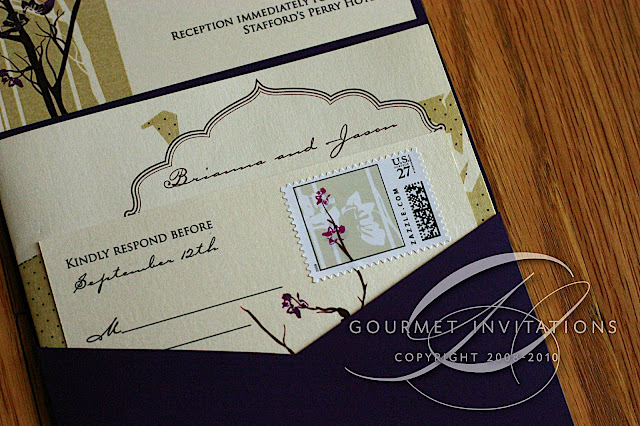
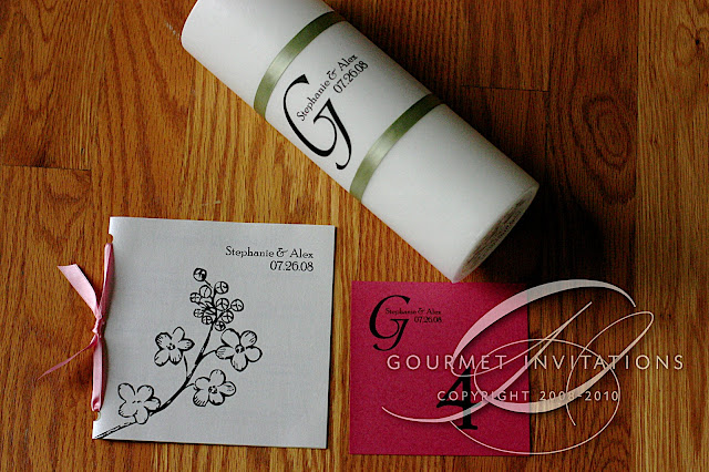
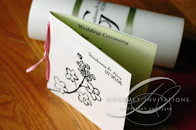
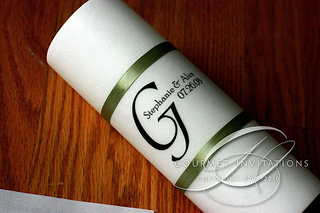
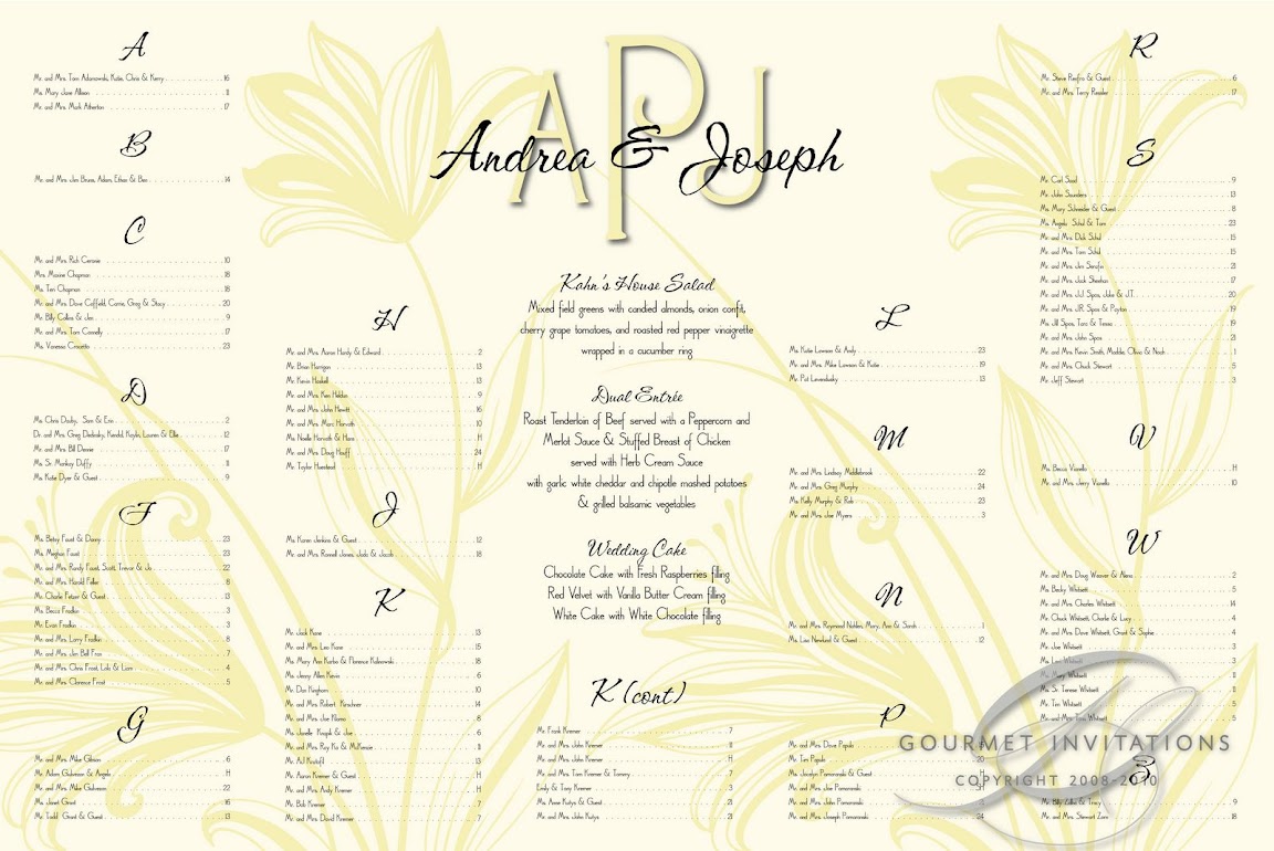
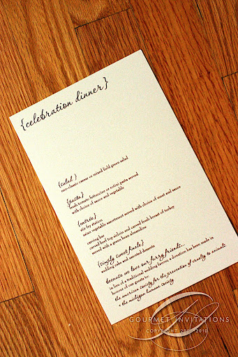
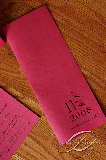
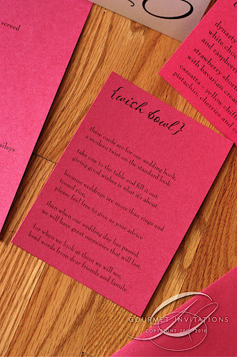
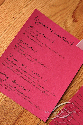
We carry wedding accessories from Weddingstar.com including toasting flutes, cake toppers, serving sets, guest books unity sand ceremony vases, sand and more in stock at our store. You can also special order any item from Weddingstar.com from us and get free S&H to our store. Stop in to see our in stock items and/or special order!

Lianne's Photo Seating Chart


this is my first photograph on a seating chart. I've seen some other on scrolls, but never on a seating chart and it turned out really nice. I can add a picture to a wedding seating chart for no additional charge.

Terrah's Extras


Terrah's Hydrangea wedding invitations were one of my favorites with the hydrangea graphic and unique color scheme. Her extras continued that with a custom sized program, Hydrangea table numbers and this beautiful seating chart with a hydrangea in the background.

Friday, July 25, 2008

Old Man Winter Invitations?


Brittany choose a very pretty swirled graphic for her invitation. I did three proofs and she choose this fun one with the bold color. But she said she kept seeing an old man in the graphic (see the last picture). He's complete with eyebrows and moustache! I did too and unfortunately the graphic was not a good one for editing, but with tons of proofs, we finally got rid of "Old Man Winter" as Brittany dubbed him. :) We did the swirl on all of her pieces - including custom wedding stamps.

Thursday, July 24, 2008

Gourmet Invitations does . . . GUITAR PICKS????


Yep, that's right. Molly asked if I would design custom guitar picks for her. As part of her gift to her future husband, she wanted to include guitar picks. I had fun designing something totally different than wedding invitations - and something far more "guy" than "girl". She had them made at Steve Clayton and they turned out awesome.

Wednesday, July 23, 2008

Brianna's Orchid Branch Amazing Pocketfolds


I've been anticipating these invitations for a long time. They really are one of my favorite all time set. Again, on this set, I've made each and every element of the invitation new and like a little surprise. The bright, deep purple pocketfolds have a large seal on the front that is attached in a new way for me. I'm so excited about the closure type seal that keeps the pocket closed. Her invitations are stunning with the orchid graphic on bare branches. The striped background gives the floral design a very masculine touch. I carried the graphic to the front and back of the postcard with these amazing matching custom postage stamps. My favorite element - this large fold out map of the state of Michigan. Since this is a destination wedding, there are a ton of locations and the detail map shows all of the locations for the wedding weekend. There is also a matching Rehearsal Dinner insert. The outer envelopes were designed to let the orchid custom designed stamp be the focus. So thank you too Brianna. I knew the moment that I met you and Jason that the invitations were going to be an extremely important element of your wedding and I'm so happy I was able to design these for you.

Stephanie's Extras


I really loved Stephanie's invitations and especially envelopes. She did a stephanotis graphic and I used the graphic in different ways. I really like the cover of the programs and the green page inside is a little surprise. I also designed a monogram that we used on the unity candle, table numbers and this awesome wedding seating chart.

Yvonne's Seating Chart


I did Yvonne's fun swirl wedding invitations and got to work on this great seating chart. I was able to get lots of her swirls in an around the seating plan to tie back to the invitations.

Friday, July 18, 2008

Cami's Garden Theme Invitations


Garden Theme and Damask sure are the big things this year. Cami has a VERY colorful wedding and reception that choosing colors was difficult. Cami decided to go with Slate Grey and I think the choice was wonderful. We matched the graphic to the slate grey. She accented the pieces with lavender metallic envelopes and directions card, that proved to be the most edited directions ever. ;) The envelope addressing is another new format for me as well - with the address lines tabbing over as they go down the envelope.

Sunday, July 13, 2008

Andrea's Seating Chart - or is it framed art?


Andrea's future mother in law contacted me to do the seating chart for her son's wedding. What was so fun about this chart is that it was of course, a seating chart. But the ultimate location? On their dining room wall! They just bought a new house and they wanted this to be the artwork in their dining room. So having the menu on the chart was particularly important to them. It turned out beautiful with the ivory lily graphic in the background.

Friday, July 11, 2008

Mimosa Events - Local Wedding Planners


I'm pleased to announce a local event planner & floral design company located right here in Moscow Idaho - Mimosa Events. They are hosting a Bridal & Event Expo July 19th.


Check out their blog for more information and lots of inspiration!

Jackie's Amazing Letterpress Invitations


I was thrilled when Jackie contacted me. She is in one of the most expensive invitation markets in the country - New York City. She had gotten crazy outrageous quotes for custom invitations when she found me. We ended up doing one of my most lavish invitations - a complete set of letterpress invitations, with lots of custom elements.

The invitation was originally designed with black flourishes in each corner. but when Jackie saw Jody's blind debossed invitations, she loved the white on white look and she decided to change it. The look is amazing with the plumes in the corners and deep black printing. The RSVP cards are different with lines for each guest and their meal choice. Reception and Directions cards completed the letterpress pieces.

Then we added modern touches - silver RSVP envelopes with custom stamps. Sashes around the inserts that have the guest's names (this replaces the inner envelope) and I even lined them with black paper. And silver envelopes with a bold graphic and custom wedding stamps that fit perfectly into the design.

These are one of my invitations of the year that I feel shows where my company is headed. Jackie said "all the little details - that is my favorite thing about all your work. All the items are beautiful but I LOVE the little surprises like the stamps and details with the addresses and fonts :)"

Megan's Black Iris Reception


Black is becoming my favorite color scheme. No matter the design, the colors are stunning and classic. Megan's very modern iris graphic is another example of this. I did her candle and table numbers. But the best piece is the wedding seating chart that I did white on black.

Wednesday, July 9, 2008

Molly's Rehearsal Dinner Invitations


Molly wanted something fun and funky for her rehearsal dinner invitations. Her wedding and invitations are so formal, she really wanted something to tell her guests this was a fun affair. She also wanted to do a combination rehearsal dinner and brunch invitation. I had these fun aqua blue z-folds on hand and I asked if I could just surprise her with the design. She went for it! (I'm so proud of you Molly ;) ) I came up with the "Boy meets Girl" theme when Molly mentioned she'd like to do a timeline of sorts. Then I designed this funky block stack in fun aquas and greens. Even the envelopes are addressed with varying colors.

Tuesday, July 8, 2008

Monica's Extras


Monica's reception is going to be gorgeous. She is a great example that the invitations don't have to match the reception. Her L shaped invitations are one of my favorites of the year. But her reception is going to be hot pink! We did lots of extras - gorgeous hot pink programs with tons of "pink" space. ;) matching white tent table numbers, menus that are going to have a beautiful napkin wrap with a pink leaf on top, and even food station signs. Monica is doing a super unique martini menu that I'd love to sneak in just to sample each. And we also did a sign explaining the concept of the Wish Bowl. Her hot pink wedding seating chart with white printing is gorgeous and will make a wonderful entrance to what is sure to be an amazing event.