Tracy from
You're the Bride suggested that Crystal contact me for her invitations. Crystal and Christopher's wedding will be a motorcycle theme, but Crystal wanted very elegant invitations. She searched and searched for motorcycle wedding invitations and found nothing but cheesy invitations.
I was thrilled to do something so different and Crystal was so much fun to work with. She sent me a picture of a shirt to use as inspiration:
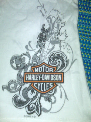
She didn't want the swirls to be so leafy though, so I set out to design something similar.
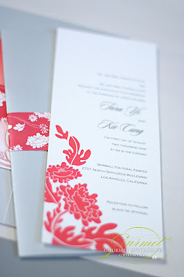
I designed a crest with their names on the cross bar and placed a subtle swirl inside the crest. The fonts on the invitation include a grungy script font that was a perfect compliment to the motorcycle theme.

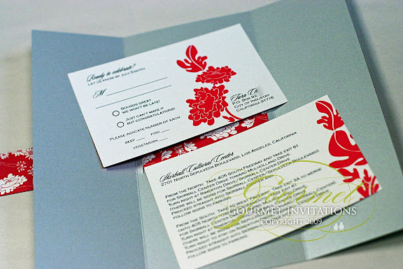
The RSVP postcard was designed with the monogram on the front and motorcycle-inspired rsvp response lines.
Custom stamps were a must for these invitations. Could you image a blue polar bear stamp on here?!

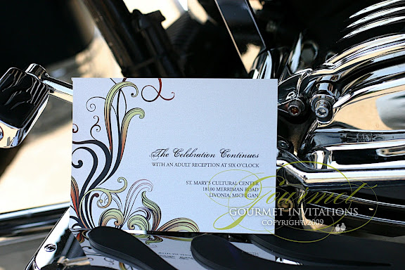
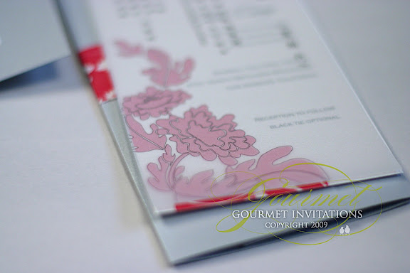
The reception card continues the theme with just the swirl pattern.
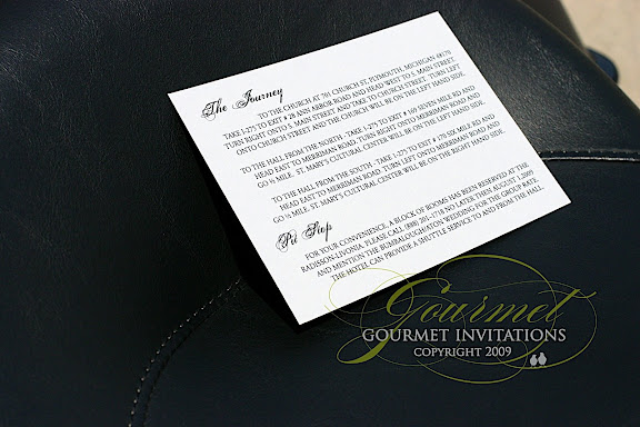
And the directions and accommodations card is designed to say "The Journey" and "Pit Stop".
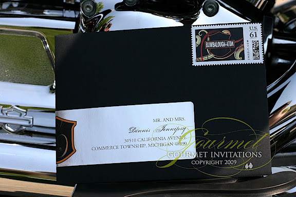
The black envelopes have another
custom stamp with their monogram. And one of my favorite details is the chrome envelope label wrap.


 Did you know we offer a variety of Wedding Thank You Notes? Stop in to see all of the choices we have available to order. You can order pre-made from our large selection of Wedding Stationary catalogs OR order something custom!
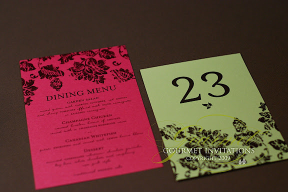
 The table numbers are a beautiful apple green and brown with the floral pattern along the bottom. And her seating chart was designed in champagne and brown with the entire saying that I started on her invitations: "Love fills a lifetime, and a lifetime begins this hour". Congrats Julie!


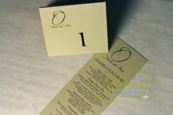
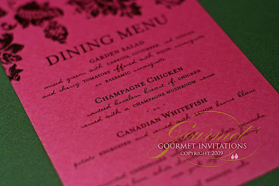
 Natalia contacted me to designer her seating chart. Then the order grew to menus and table numbers too. I was able to accommodate the additions for her wedding. I can never turn down menus. :)